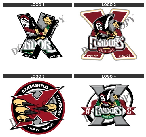
Of the four choices, I would choose logo #3. I love the claws grabbing the large ten "X". I would like to see them make the claws look a little more 'rough' as they look in their actual logo. A few claw marks on the "X" would look good too! Second choice would be logo #2. This one looks good, but the "X" in this one gets a little lost. It would look better if they had used the same "X" from logo #3 for this one. I do not like logos #1 or #4. Both are a little too busy and I don't think they would look very good on a jersey, when you see it for a distance.
As far as which one will win, I am putting my money on #3.
 While we are discussing the Condor's logo, here is their original logo, back when they were known as the Bakersfield Fog. This is one of my all time favorite logos. I even have a Fog jersey in my collection. When I emailed them to ask why they had changed their name/logo, they told me that they changed their name due to the bad connotations that were linked with the name Fog, due to the fact that Bakersfield is known for its dense fog, and that many people have been killed due to the fog. Too bad, because this is such a cool logo and name!
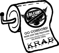 And lastly, something else I found on the Condor's site. A piece of merchandise that I have not seen a hockey team sell before... toilet paper! The product details on the web site state: "This is a roll of toilet paper that has the Fresno Falcon's logo on it and says 'Wipe out the Falcons.'" I wonder if the Falcons have Condor's toilet paper for sale on their site?

No comments:
Post a Comment